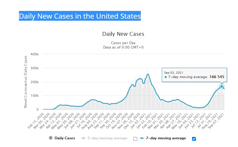
This graph shows that (hopefully) Covid cases in the US have already peaked. This may be important because I noticed mask mandates seem to come after peaks, not before them. President Biden has just made his vaccine mandate speech, so I wanted to be armed with facts should he try to take credit for what should be the coming dip in cases.
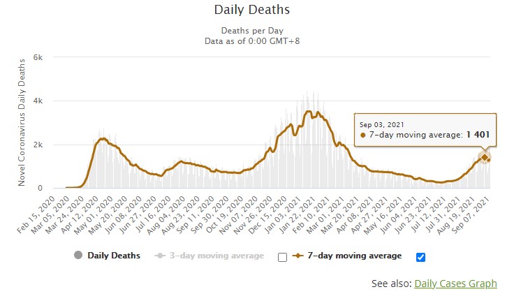
This graph shows daily deaths. I think daily deaths show a more accurate picture, as cases more variables go into the number of cases such as amount and kind of testing. These numbers also show that this current COVID spike may have peaked. If this cycle holds, the US can expect another spike to stat sometime in November. I will be interested to see if the raise to the levels of last year of level off due to vaccinations, suggesting heard immunity is setting in. If we see a divergence between cases (going up) and deaths (going down) than that could mean vaccination is doing good at preventing death, but not cases. It could also mean that the dominant variant is weaker, less deadly. This would follow a common pattern of attenuation that viruses go thorough.
What these graphs also show is that COVID is going to be with us for the long haul, so we need to turn our focus from hiding from it to living with it. That doesn’t mean giving up, it means assimilating the risk into our daily lives while managing it. Whatever mandates will still have at the end of his year will probably be with us in perpetuity, so we better consider carefully now what rights we’re willing to part with because they won’t be coming back until either COVID goes away, or we demand them back.
